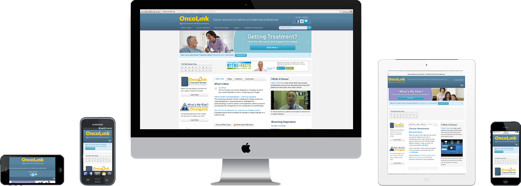
If you have visited OncoLink in the last month, you may have noticed things look a little “cleaner.” But this new look is more than just some housekeeping and white space. Our site has been completely redesigned using a responsive web design approach. Today’s internet users aren’t sitting at a desktop computer; we are using a tablet, sitting by the pool, or looking up a new diagnosis on our smartphones in the doctor’s office. If you have ever done this, you know it can be very hard to navigate a webpage on the small screen of a phone.
Responsive design websites respond to their environment – detecting the device you are using and resizing the page to fit your device. Rather than designing a site for each device (i.e., iPhone, android, iPad, etc.), one responsive design site adapts to the needs of all our users.
These updates don’t change our commitment to providing up to date cancer information – it just allows us to make it easier for you to find what you need. We hope you like the new look and, as always, we welcome your feedback!
